THE OBJECTIVE
As a new business, the identity of the brand was not fully developed. The company brand was very simple, using a simple font and two graphic hands holding a circle represented the company. To attract potential business the brand needed an update.
The solution
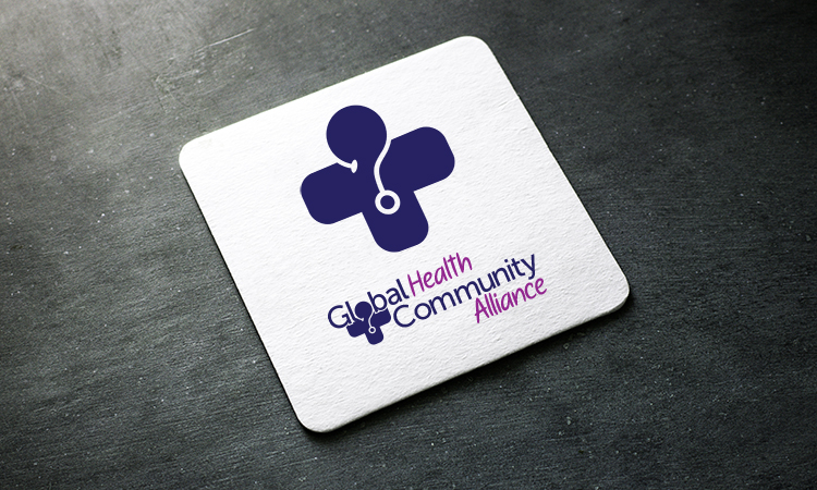
The logo centered around the company name and the base of the work, global health equity. The medical icon doubled as the company icon as well as the brand identity. At the top of the medical icon, instead of a squared shape, the shape was molded to be more circular to showcase the global portion of the brand.
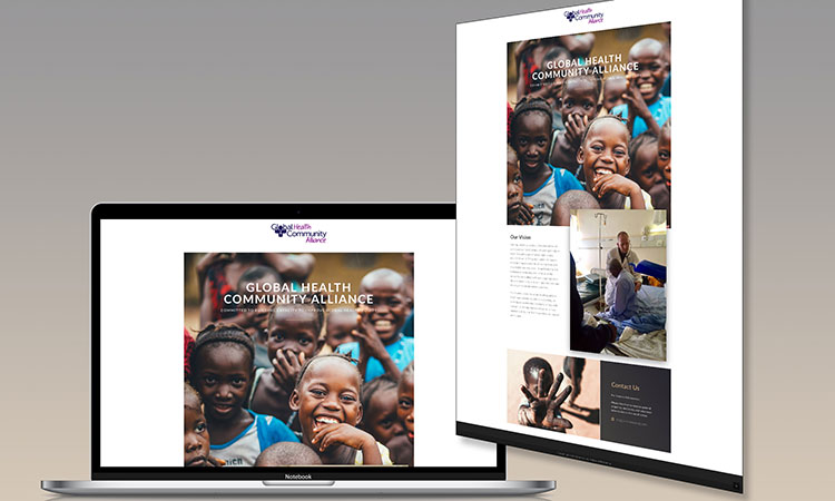
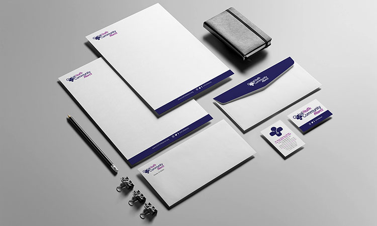
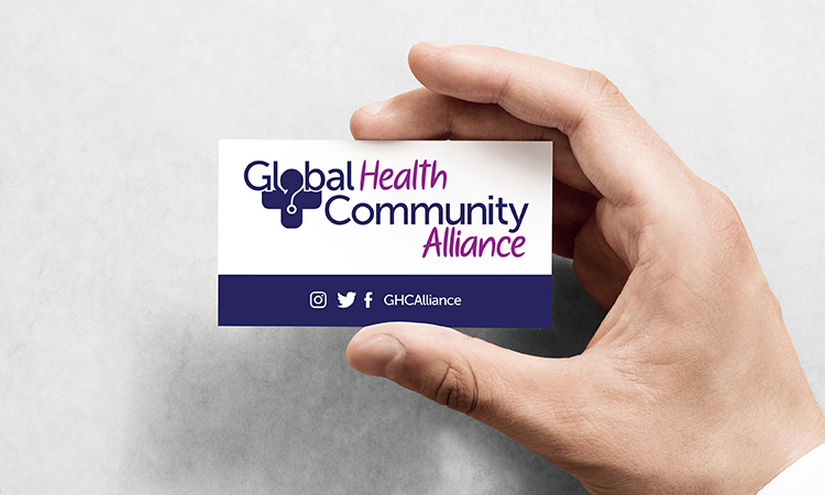
With the client choosing the color scheme after presenting various renditions of the logo, the agency was able to provide the company with brand assets that they would be able to use as they pleased. The agency created letterheads, business cards and developed the website for the brand to fully equip the company with a full brand identity.